Dimensions Detailing Lines Pane
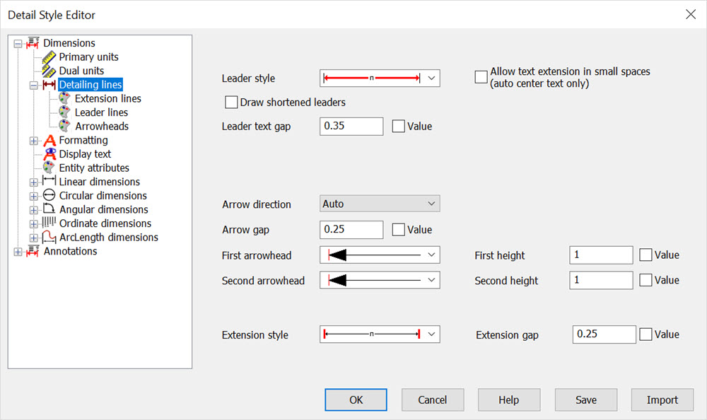
This pane, shown below, provides the options for controlling how to display the detail entities lines.
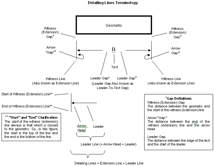
Detailing lines are the leader, arrow and witness (extension) lines of a detail entity. The next figure explains terms found on this pane.


Leader style
How the leader is to be drawn. The graphical representation of the list box shows how the leader style would appear on a linear dimension. For detail entities, the primary selections of interest are the first, second and fourth. This is because detail entities only have a first leader.
-
Broken leader: Both the first and second leader lines are displayed.
-
First leader: Display only the first leader line
-
Second leader: Display on the second leader line
-
No leader: Displays neither the first nor the second leader line
-
Solid leader: Displays both the first and second leader line as a solid line under the text
-
Solid first leader: Creates solid leader, but displays only the first arrowhead
-
Solid second leader: Creates solid leader, but displays only the second arrowhead
-
Solid no arrows: Creates solid leader and displays no arrows.
Allow Text extension In Small Spaces
Specifies if the detail line is to be drawn under the text of the detail entity, or to the side.
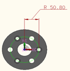
Sample of tight leader line with text extension:

Note: When using this feature also try using the Format\Auto-center text feature for placement of text.
Leader-to-text gap
This is also known as the leader gap. The distance between the edge of the text and the start of the leader.
Ratio/Value check box
This check box allows you to specify either an absolute value (using the current part units) or a ratio value (leader gap over text height) in the Leader-to-text gap field. For example, if the current parts units in cm, and you select the Value check box and type .5, the leader gap becomes 0.5 cm. Or, if you select the Ratio check box and type .5, the leader gap becomes one-half of the text height.
Arrow direction
This option controls which direction the arrows are to point. Auto: KeyCreator determines the arrow direction for best fit. In: Arrows are on the inside pointing out. This is how they are displayed in the Leader Style list box. Out: Arrows are on the outside pointing in.
Arrow gap
Specifies the distance from the arrow to the end of the witness line to which it is pointing.
First arrowhead
Type of arrowhead displayed at the first selection point of the dimension:
-
Wedge
-
Open arrow with penetrating leader
-
Filled arrow
-
Open arrow; leader does not penetrate
-
Slash
-
Open circle with penetrating leader
-
Filled circle
-
Open circle; leader does not penetrate
-
Open triangle base; leader does not penetrate
-
Filled triangle base
-
No arrowhead
First height
Height of the first arrowhead
Second arrowhead
Type of arrowhead displayed at the second selection point of the dimension. See First arrowhead, above.
Second height
Height of the second arrowhead
Witness style
The style in which the witnesses are displayed:
-
Open circle; leader does not penetrate
-
Open triangle base; leader does not penetrate
-
Filled triangle base
-
No arrowhead
Witness gap
Specifies the distance between the geometry being detailed and the start of the witness extension line
Extension line attributes
Attributes controlling the display of the witness extension lines.
Leader line attributes
Attributes controlling the display of the leader lines.
Arrowhead attributes
Attributes controlling the display of the arrowheads.